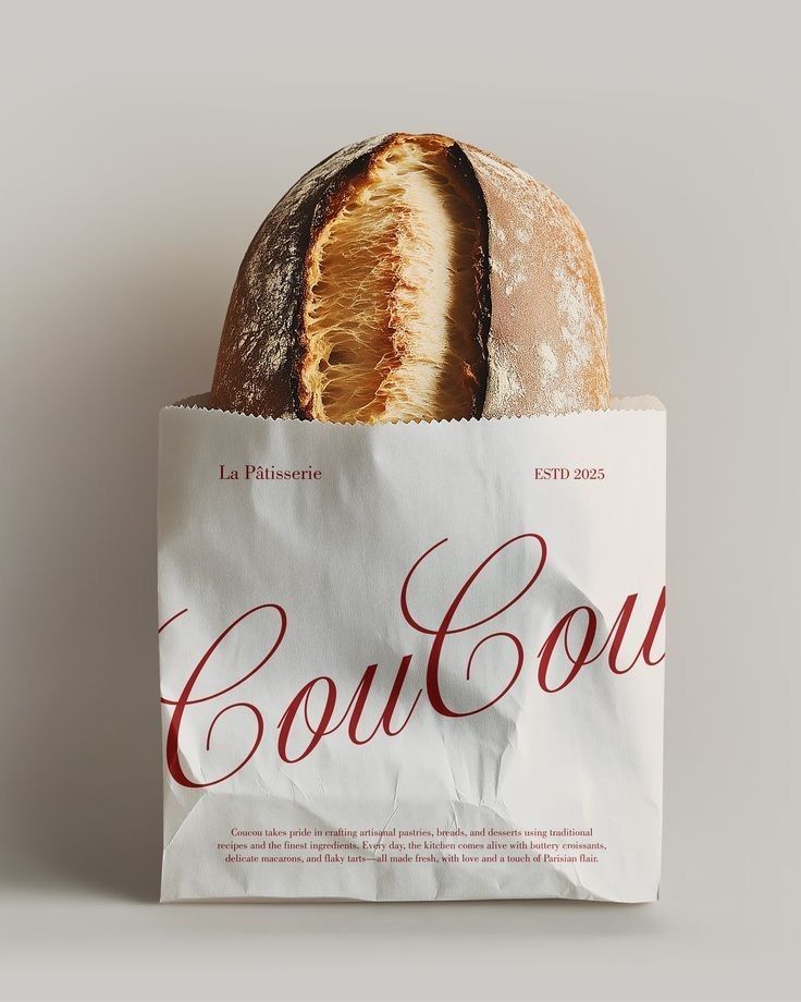
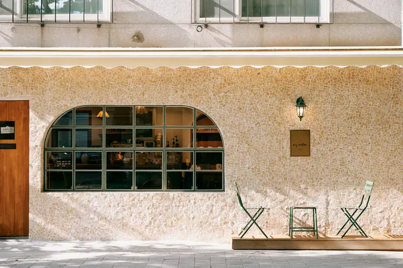
I rebranded IZOLA Bakery to modernize its visual identity while preserving its artisanal and community-focused values. I refined the logo, introduced a clean and cohesive color palette, and selected modern typography to reflect the bakery’s story. I designed packaging, signage, and digital prototypes to ensure the brand identity is consistent and welcoming across every touchpoint.


#7F9F7A
#D2AE7A
LIBRE BODONI
AVENIR ROMAN
Chosen for its elegant serif structure and warmth. The slight softness in its curves balances the clean, minimal layout.
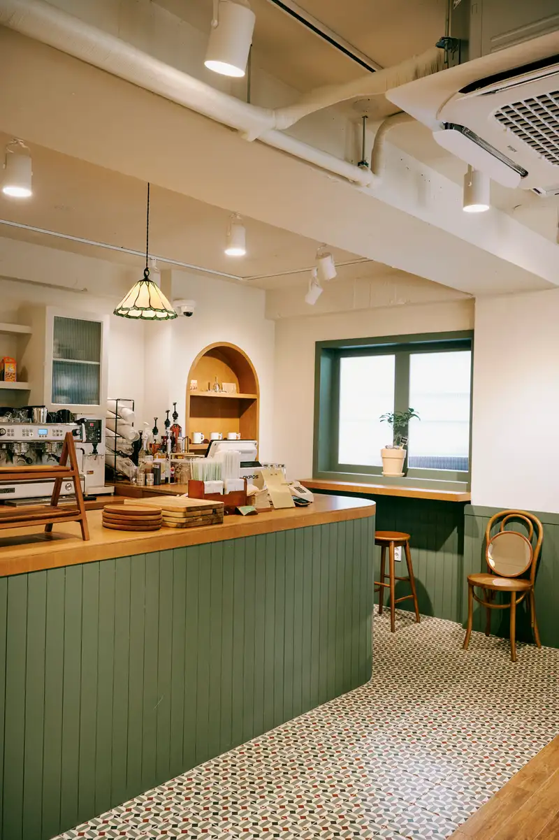
Izola is rooted in ritual. From the first morning loaf to the last pastry of the day, every detail reflects care, craft, and warmth. The identity system balances softness with structure, allowing the product to feel elevated while remaining approachable.