mini is a concept product designed to support individuals navigating pregnancy for the first time.

The experience focuses on clarity, emotional reassurance, and simplified access to essential resources.

Role: Product Design, UX Strategy, UI System
Timeline: 8 Weeks
Tools: Figma, Illustrator


mini is a concept product designed to support individuals navigating pregnancy for the first time.

The experience focuses on clarity, emotional reassurance, and simplified access to essential resources.

Role: Product Design, UX Strategy, UI System
Timeline: 8 Weeks
Tools: Figma, Illustrator


The Problem

Existing maternal health tools frequently overload users with features and dense content. While information is abundant, it is not always accessible or emotionally considerate.


First-time parents are managing uncertainty, appointments, health changes, and personal stress. The opportunity was to design a system that balances practical organization with emotional reassurance.

The goal was not to simplify information, but to simplify the experience.


Approach

My product strategy focused on three principles:

Clarity Over Density
Navigation follows a clear left-to-right progression with minimal branching to reduce decision fatigue.


Warmth Without Infantilization
The visual language introduces softness through color and spacing while maintaining credibility and trust.


Modular Scalability
Content blocks were designed as repeatable components, allowing the system to expand without disrupting cognitive flow.


The Solution

mini combines lightweight navigation, curated educational content, and localized support resources into a unified interface.

Key design decisions included:

  • Generous spacing to reduce visual overwhelm

  • A muted, warm color system to signal emotional safety

  • Simplified dashboard architecture for quick daily check-ins

  • Plain-language medical guidance presented in digestible segments

The interface prioritizes progress visibility, appointment tracking, and behavioral logging while maintaining a calm visual rhythm.


Its soft, rounded forms introduce approachability without feeling decorative. The subtle curves help reduce the clinical tone often associated with healthcare products.

Lexend

Designed to improve readability and reduce visual stress, it supports long-form content and instructional guidance. Its open letterforms and generous spacing enhance legibility on mobile screens.

#F69D84

#EDDEDA

System Design

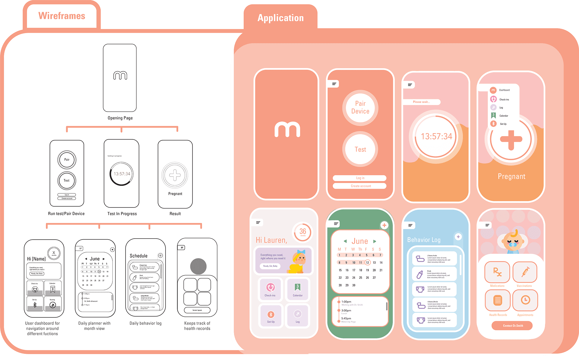
Wireframes focused on structural clarity and user flow validation. The final UI introduced warmth through color and rounded geometry while preserving hierarchy and readability.

Typography balances approachability with legibility. Component spacing and consistent alignment reinforce predictability, helping users feel grounded in high-stress moments.

The modular system allows for future expansion into additional maternal health services without redesigning core architecture.


The product was prototyped in Figma and prototyped to test real interaction flows and responsive behavior.

Emphasis was placed on:

  • Consistent left-to-right progression

  • Clear visual anchors for primary actions

  • Scalable content modules

  • Mobile-first optimization

This phase validated the clarity of navigation and overall cognitive load.


Personas

mini was designed to support different emotional and behavioral patterns during pregnancy. The following personas informed navigation structure, tone, and feature prioritization.


Takeaways

Designing mini strengthened my ability to build emotionally intelligent digital systems within a healthcare context.


This project reinforced that in sensitive environments, perceived safety is shaped as much by spacing, tone, and visual rhythm as by functionality.


mini demonstrates my ability to translate complex health information into a cohesive, human-centered product experience.


Areas for improvement

My Approach

My Solution

Maternal health tools often overwhelm users with dense features and information. While resources are plentiful, they are not always accessible or emotionally supportive. First-time parents are navigating uncertainty, appointments, physical changes, and personal stress all at once. The opportunity was to design a system that balances practical organization with emotional reassurance. The goal was not to reduce the depth of information, but to make the experience feel simpler, calmer, and easier to navigate.

Bridging Clarity and Care

The Problem


First-time parents are managing uncertainty, appointments, health changes, and personal stress. The opportunity was to design a system that balances practical organization with emotional reassurance.


The goal was not to simplify information, but to simplify the experience.


Pregnancy apps often prioritize data tracking over emotional clarity. Many feel clinical, fragmented, or overwhelming, especially for first-time parents navigating new medical information and lifestyle changes.


mini was designed to reduce friction and create a supportive digital environment that feels calm, human, and trustworthy.


Existing maternal health tools frequently overload users with features and dense content. While information is abundant, it is not always accessible or emotionally considerate.


A Calm, Accessible Companion

for First-Time Parents

A Calm, Accessible Companion

for First-Time Parents

NOTE

mini is a concept product designed to support individuals navigating pregnancy for the first time.

The experience focuses on clarity, emotional reassurance, and simplified access to essential resources.

Role: Product Design, UX Strategy, UI System
Timeline: 8 Weeks
Tools: Figma, Illustrator