HOME

Tanbii is a carbon tracking app that rewards users for adopting low emission habits, blending real world action with virtual incentives.
This case study explores my redesign of Tanbii’s onboarding and home screen experience to create a more intuitive, engaging, and user-centered interface especially for first time users.
Create a more welcoming and intuitive first-time user experience
Establish a cohesive and friendly visual language rooted in nature
Increase clarity of primary actions: play, track, and share
Simplify the interface to reduce friction and cognitive load
Make the app more emotionally engaging for a broad user base
GOALS
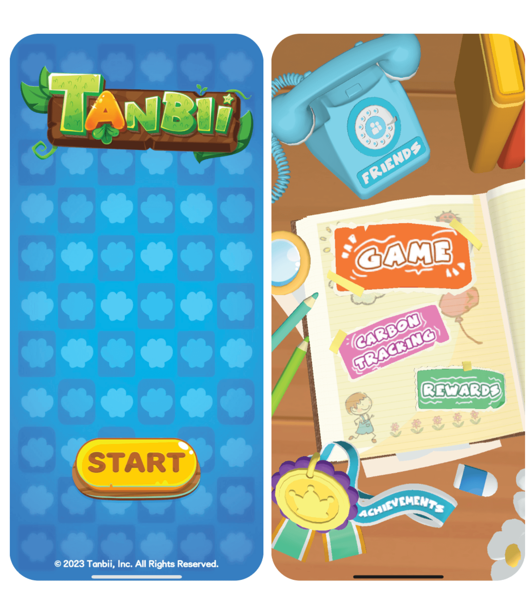
The original interface was visually cluttered, inconsistent in tone, and lacked clear information hierarchy—issues that made the experience feel disjointed and less accessible to new users. Despite its innovative goals, the app struggled to effectively communicate its core value: empowering users to track and reduce their carbon footprint through fun, gamified systems.
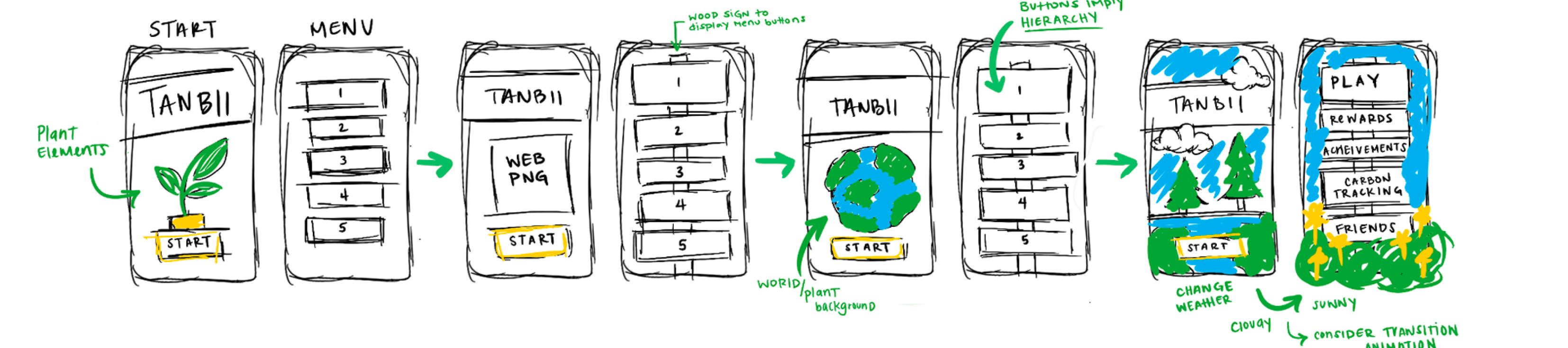
My process began with rapid wireframing to identify how layout, typography, and iconography could better support user needs. I explored early iterations focusing on:
Centralizing core actions ("Start", “Track”)
Replacing harsh gradients with nature-based illustrations
Softening the color palette to reduce screen fatigue
My process began with rapid wireframing to identify how layout, typography, and iconography could better support user needs.
I explored early iterations focusing on:
Centralizing core actions ("Start", “Track”)
Replacing harsh gradients with nature-based illustrations
Softening the color palette to reduce screen fatigue
Sketches and early mockups revealed that leaning into playful but clean visual design would increase clarity and approachability.
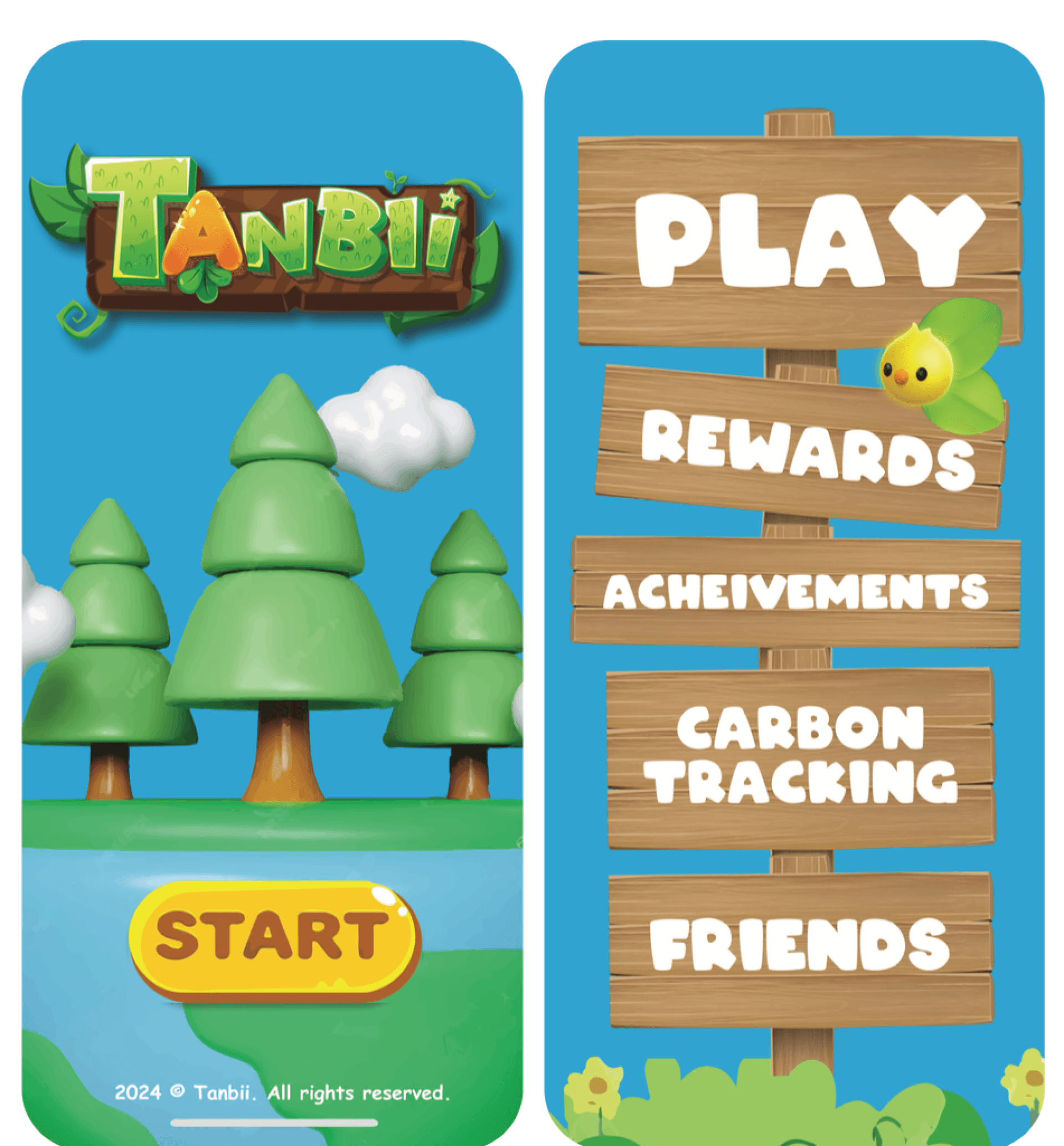
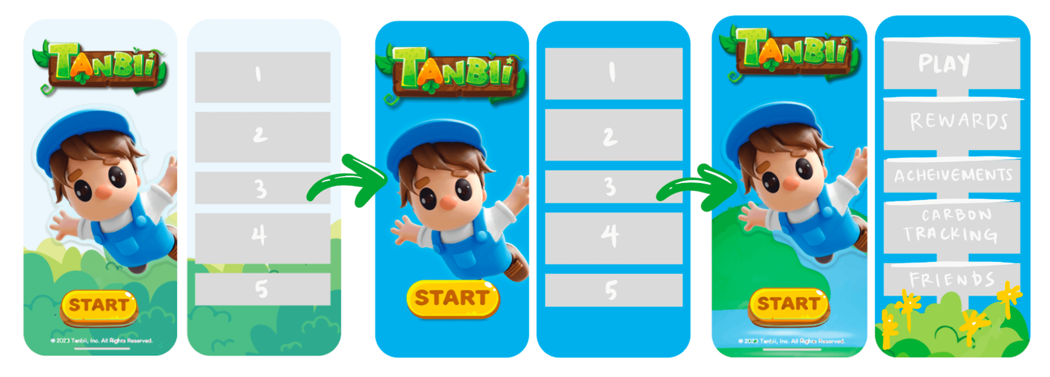
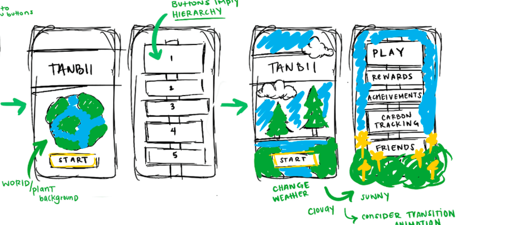
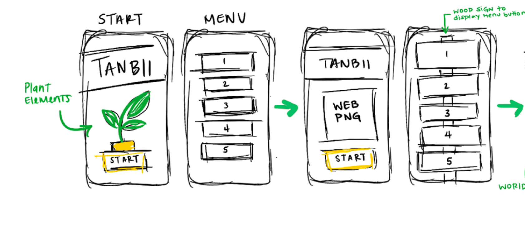
The redesign is centered around nature themed visual identity and earthy tones to evoke environmental awareness.
I introduced a simple, vertically stacked navigation system with clear CTAs: Play, Rewards, Carbon Tracking, and Friends.
Typography was unified using a bold, friendly headline font paired with clean body text for legibility. Shadows, outlines, and icon consistency were also refined to reduce visual noise and improve overall cohesion between frames.
The redesigned UI provides a dramatically improved first impression, offering visual clarity, user trust, and environmental storytelling in one cohesive experience.Although formal testing is ongoing, early user feedback has highlighted the following perceived improvements:
Easier navigation and clearer action flow
More cohesive and enjoyable visual environment
Stronger emotional connection to the app’s mission
By prioritizing simplicity and emotional engagement, the new design transforms carbon tracking from a task into a rewarding habit.
The redesigned UI provides a dramatically improved first impression, offering visual clarity, user trust, and environmental storytelling in one cohesive experience.Although formal testing is ongoing, early user feedback has highlighted the following perceived improvements:
-Easier navigation and clearer action flow
-More cohesive and enjoyable visual environment
-Stronger emotional connection to the app’s mission
By prioritizing simplicity and emotional engagement, the new design transforms carbon tracking from a task into a rewarding habit.
OVERVIEW
THE CHALLENGE
PROCESS AND IDEATION
FINAL DESIGN
IMPACT

MARKET RESEARCH
Your feedback is invaluable in ensuring the creation of an intuitive interface. This survey will cover all aspects of the
apps design.

ABOUT ME WORK CONNECT
Tanbii is a carbon tracking app that rewards users for adopting low emission habits, blending real world action with virtual incentives.
This case study explores my redesign of Tanbii’s onboarding and home screen experience to create a more intuitive, engaging, and user-centered interface especially for first time users.
OVERVIEW
Sketches and early mockups revealed that leaning into playful but clean visual design would increase clarity and approachability.
The original interface was visually cluttered, inconsistent in tone, and lacked clear information hierarchy—issues that made the experience feel disjointed and less accessible to new users. Despite its innovative goals, the app struggled to effectively communicate its core value: empowering users to track and reduce their carbon footprint through fun, gamified systems.
THE CHALLENGE
My process began with rapid wireframing to identify how layout, typography, and iconography could better support user needs. I explored early iterations focusing on:
Centralizing core actions ("Start", “Track”)
Replacing harsh gradients with nature-based illustrations
Softening the color palette to reduce screen fatigue
PROCESS AND IDEATION
Create a more welcoming and intuitive first-time user experience
Establish a cohesive and friendly visual language rooted in nature
Increase clarity of primary actions: play, track, and share
Simplify the interface to reduce
friction and cognitive load
Make the app more emotionally engaging for a broad user base
The redesign is centered around nature themed visual identity and earthy tones to evoke environmental awareness.
I introduced a simple, vertically stacked navigation system with clear CTAs: Play, Rewards, Carbon Tracking, and Friends.
Typography was unified using a bold, friendly headline font paired with clean body text for legibility. Shadows, outlines, and icon consistency were also refined to reduce visual noise and improve overall cohesion between frames.
FINAL DESIGN
The redesigned UI provides a dramatically improved first impression, offering visual clarity, user trust, and environmental storytelling in one cohesive experience.Although formal testing is ongoing, early user feedback has highlighted the following perceived improvements:
Easier navigation and clearer action flow
More cohesive and enjoyable visual environment
Stronger emotional connection to the app’s mission
By prioritizing simplicity and emotional engagement, the new design transforms carbon tracking from a task into a rewarding habit.
IMPACT
MARKET RESEARCH
Your feedback is invaluable in ensuring the creation of an intuitive interface. This survey will cover all aspects of the
apps design.
GOALS
ABOUT ME WORK CONNECT
Tanbii is a carbon tracking app that rewards users for adopting low emission habits, blending real world action with virtual incentives.
This case study explores my redesign of Tanbii’s onboarding and home screen experience to create a more intuitive, engaging, and user-centered interface especially for first time users.
OVERVIEW
Sketches and early mockups revealed that leaning into playful but clean visual design would increase clarity and approachability.
The original interface was visually cluttered, inconsistent in tone, and lacked clear information hierarchy—issues that made the experience feel disjointed and less accessible to new users. Despite its innovative goals, the app struggled to effectively communicate its core value: empowering users to track and reduce their carbon footprint through fun, gamified systems.
THE CHALLENGE
My process began with rapid wireframing to identify how layout, typography, and iconography could better support user needs. I explored early iterations focusing on:
Centralizing core actions ("Start", “Track”)
Replacing harsh gradients with nature-based illustrations
Softening the color palette to reduce screen fatigue
PROCESS AND IDEATION
Create a more welcoming and intuitive first-time user experience
Establish a cohesive and friendly visual language rooted in nature
Increase clarity of primary actions: play, track, and share
Simplify the interface to reduce
friction and cognitive load
Make the app more emotionally engaging for a broad user base
GOALS
The redesign is centered around nature themed visual identity and earthy tones to evoke environmental awareness.
I introduced a simple, vertically stacked navigation system with clear CTAs: Play, Rewards, Carbon Tracking, and Friends.
Typography was unified using a bold, friendly headline font paired with clean body text for legibility. Shadows, outlines, and icon consistency were also refined to reduce visual noise and improve overall cohesion between frames.
FINAL DESIGN
The redesigned UI provides a dramatically improved first impression, offering visual clarity, user trust, and environmental storytelling in one cohesive experience.Although formal testing is ongoing, early user feedback has highlighted the following perceived improvements:
Easier navigation and clearer action flow
More cohesive and enjoyable visual environment
Stronger emotional connection to the app’s mission
By prioritizing simplicity and emotional engagement, the new design transforms carbon tracking from a task into a rewarding habit.
IMPACT
MARKET RESEARCH
Your feedback is invaluable in ensuring the creation of an intuitive interface. This survey will cover all aspects of the apps design.